A little bit about NAFRI's national delivery teams: The delivery teams have members selected from multiple regions who take the time to focus on becoming skilled in using various online delivery methods and providing a consistent/engaging delivery of materials for fire training.
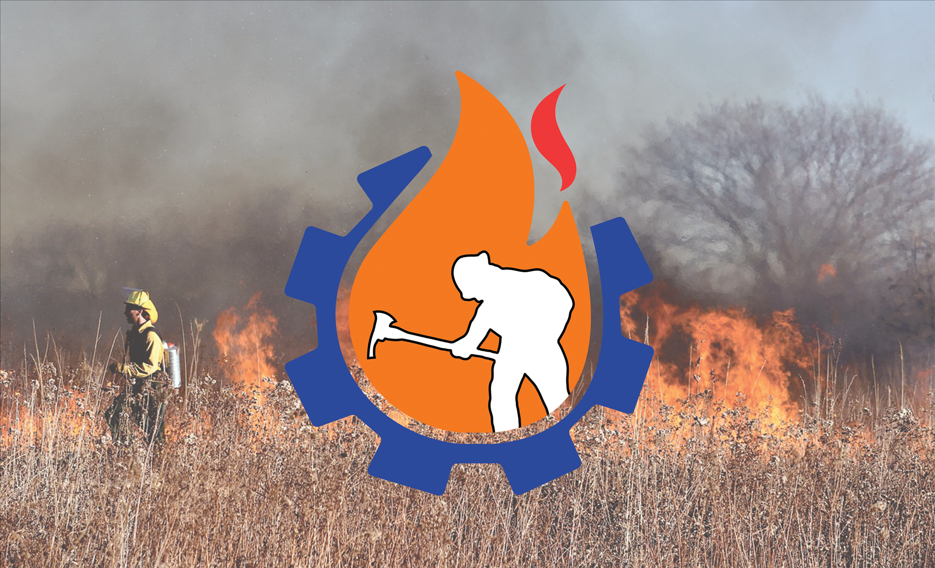
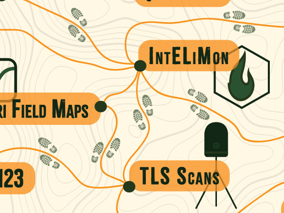
I had so much fun with this logo and went through many drafts until it eventually became what you see above. The logo was created in Adobe Illustrator and incorporates multiple elements to represent delivery teams. The cog on the outside of the flame is to represent the delivery of training materials, since training is a work in progress and cogs can represent things that are constantly moving and working.
The flame is meant to represent wildland fire as well as the figure in the middle (a wildland firefighter digging with a pulaski).
This was the first logo I created outside of my time as a graphic design student. I used to despise the logo making process as it was a very particular task that involved A LOT of back and forth between designer and client (even making my own logo was quite the process).
However, during the creation of this project, I started to realize that the logo creation process was a necessary experience as a graphic designer. I came to love being part of the process of creating a new brand/refreshing the look of an existing one. This is one of many logo projects to come!